Use Infogram's sunburst chart to visualize hierarchical data structures. The sunburst chart consists of several rings (or circles) that represent different levels of hierarchy, with the innermost one illustrating the top level – it's great for showcasing how one ring is split into its contributing pieces. Follow the steps below to create your own sunburst chart.
Adding the chart to your project
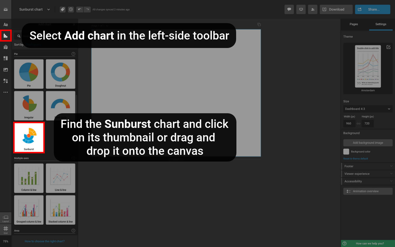
- In the Infogram editor, select Add chart in the left-side toolbar.
- Type “sunburst” in the search bar or scroll down the chart list to find it in the Pie chart section.
- To add the chart to the canvas, click on its thumbnail or drag and drop it onto the canvas.

Adding data to the sunburst chart
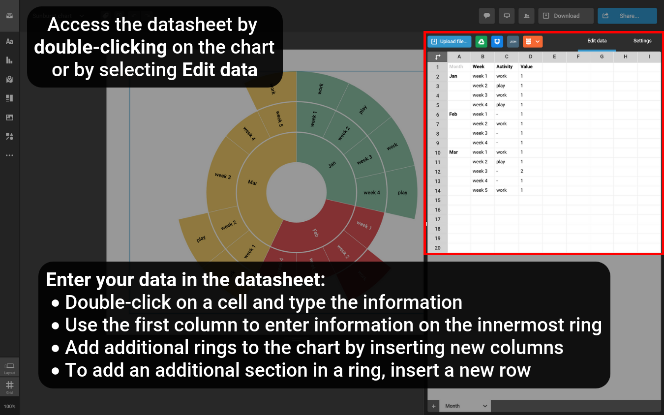
- Double-click on the chart to open its datasheet. All of our charts come with placeholder data for you to see the proper formatting.
- Add your data by double-clicking on a cell and typing it in. Use the first column to enter information on the innermost ring. The data you enter in the following columns to the right will be displayed as contributing levels to the central ring.
- You can add additional rings to the chart by adding new columns in the datasheet. Just right-click on the datasheet and select Insert column on the left or Insert column on the right. Then, add your data.
- To add an additional section in a ring, insert a new row in the datasheet – right-click on a row number and select Insert row above or Insert row below. Then, enter your data in the cell representing the specific section.
In addition to typing the data in manually or copy-pasting, you can upload a spreadsheet, add a document from Dropbox, connect to a Google Drive document, use a JSON feed URL, and source your data from online databases. Learn more in the article about adding data to a chart.

Customizing the chart
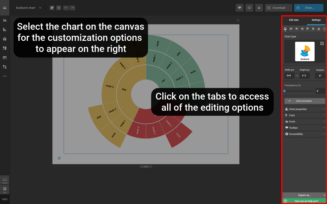
There are several ways for you to make the chart more unique. Once you've selected the chart on the canvas, you'll see the editing options in the right-side settings panel.
- Chart properties. You'll find several settings you can toggle on/off. E.g., you can select whether you'd like to display the center label and the values, enter the center label in the text box, and adjust the spacing between the levels of your chart and change the center radius.
- Color. Select the color boxes to change the chart's colors – choose a brand color, use the color picker, or copy and paste a hex color code. You can also adjust the slice contour coloring and select the value colors.
- Fonts. Adjust the font size and color, and pick a font from the dropdown. Select Advanced settings to adjust individual text elements.
- Tooltips. Enable or disable the tooltips. They appear as viewers hover over your chart.
- Accessibility. Make your chart more accessible by adding a label and a description. The information will be read out to the viewers who are using screen readers. Learn more in the article about creating accessible content.

Learn more about Infogram's charts in the Charts section of the knowledge base, and find out how you can share and download it in the Share section.