Word clouds help identify trends and patterns that might be difficult to see otherwise. Use them to display text in varying font sizes, weight, or colors to show frequencies or categories.
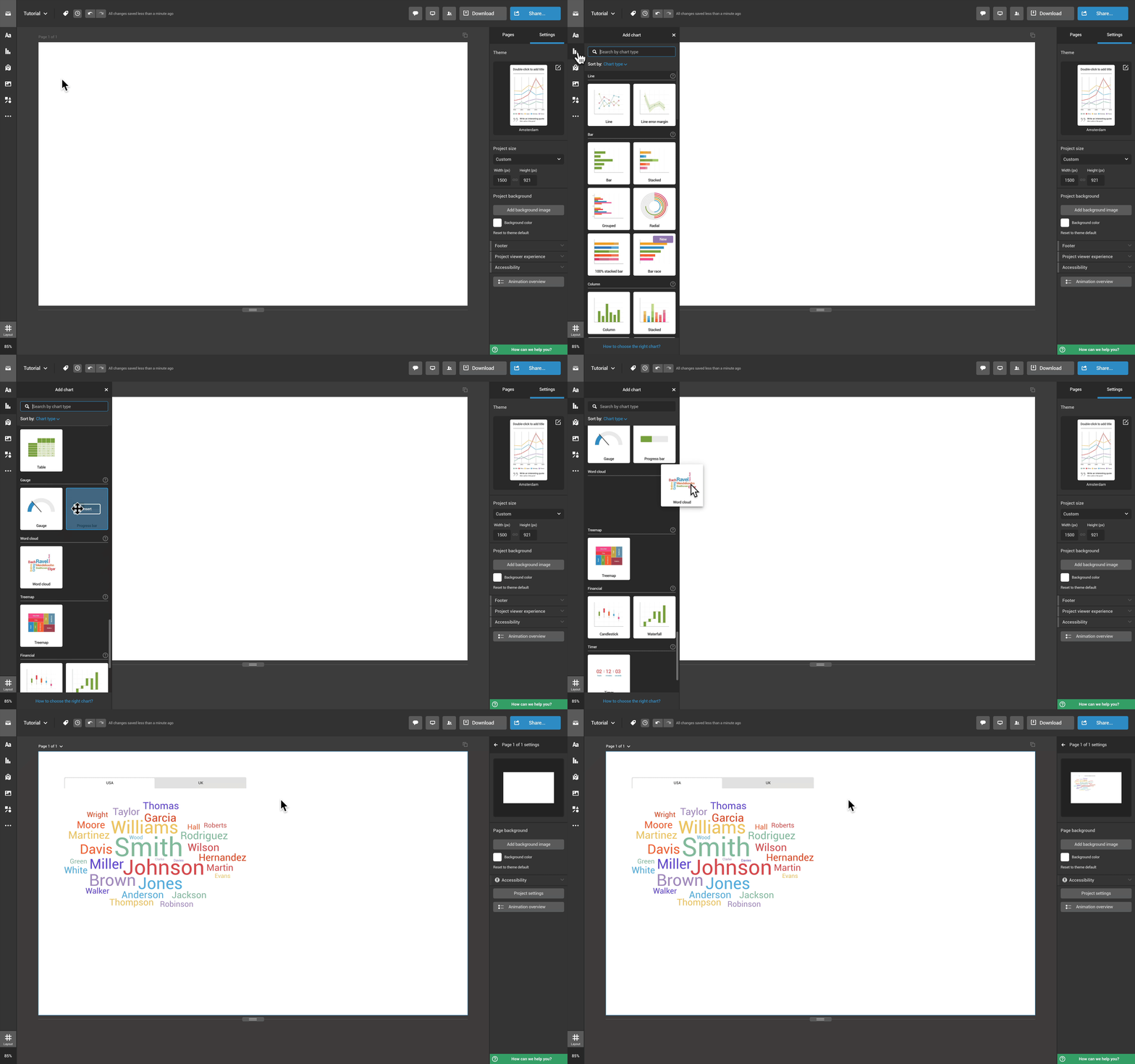
- To create a word cloud, click on Add chart in the toolbar on the left, find the Word Cloud, and click on it or drag and drop it onto the canvas.

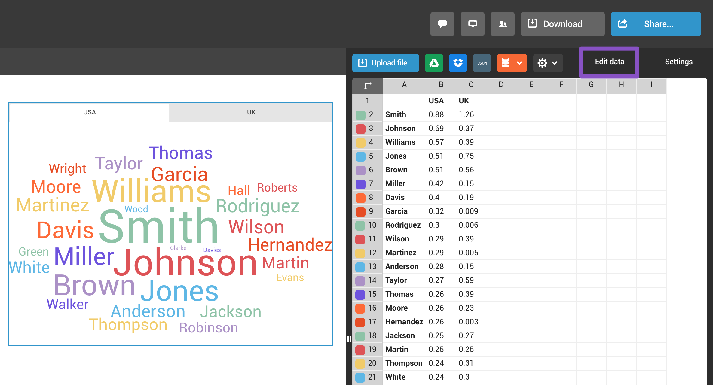
- To access the datasheet, double-click on the word cloud or expand the Edit data tab in the right-side panel.
Use the first column for the names you want to display and enter the figures attached to them in the second column. If you'd like to add an additional tab to the chart, type its name in the first row and create a new column (like in the example). Read more on adding data to a chart here.
- You can customize the chart to your liking in the settings panel on the right. You can change text direction under Chart properties, customize colors and fonts, and do much more. Browse through the Charts section of our Support page to learn more about chart customization.