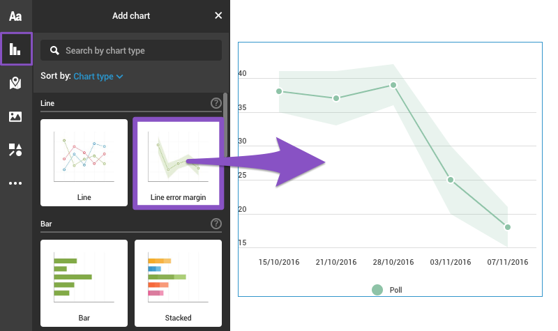
With error margins, standard deviations or probability spans over time can be easily viewed at a glance – you can add them as whole numbers or percentages. Use the line error margin chart to display financial data, poll results, or any data that contains a probability or an error margin.
- Click Add chart in the left-side toolbar and choose the Line error margin chart from the list.

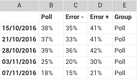
- Double-click on the chart or go to the Edit data tab in the settings panel to access the datasheet:
Column A: insert dates in the format you prefer
Column B: provide data points to create a line
Column C: enter the negative error values
Column D: enter the positive error values
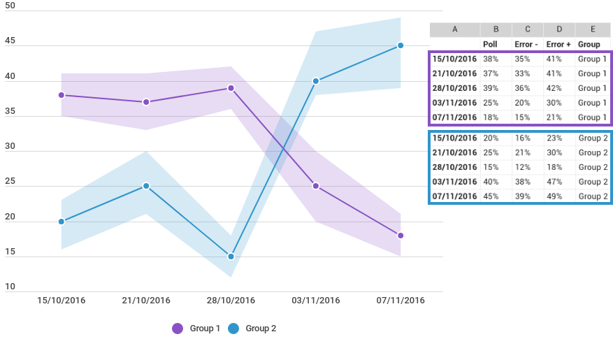
Column E: name each separate group Pro tip: Each group has its own line. To create a new line with error margins, use the same time frame as in the others and provide a different group name in column E.
- Use the settings panel on the right to customize the chart. For more, read the tutorial about Editing chart settings.