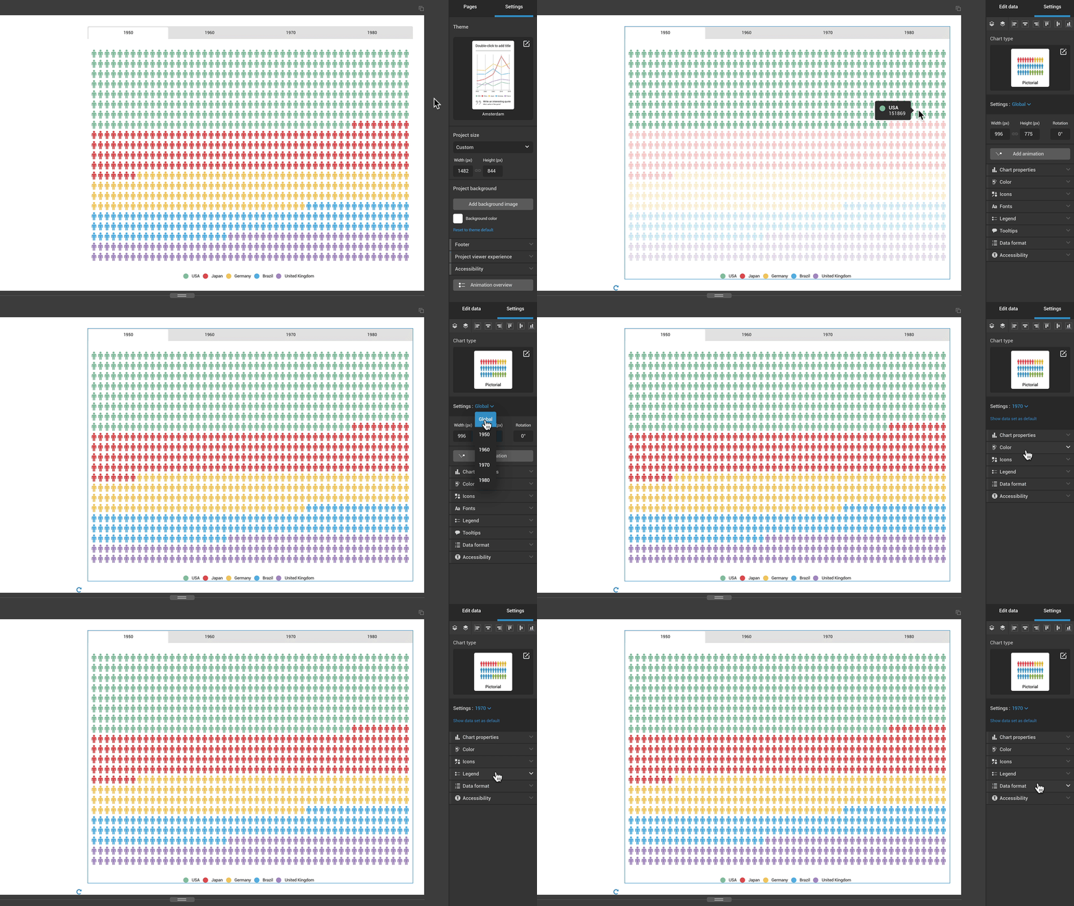
If your chart has multiple data columns or sheets (if there are multiple tabs displayed above the chart), you can adjust the settings for each sheet individually.
- Click on the chart to select it, then expand the Settings: Global drop-down at the top of the settings panel on the right.
- Select a sheet by its name.

From here, you can customize colors, axis labels, axis ranges, icons, and the number format (for each individual dataset). Thus you can have different colors, different icons, or different axis labels for each tab in your chart.
Note: Enabling chart settings per tab will disable global settings and vice-versa. To return to the previous format, click Reset all to global settings at the bottom of the settings panel when in individual sheet mode.